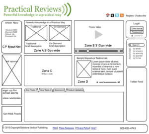
Digital treatment of a print product—a four page newsletter launched January of ’11. The concept and design were based on a three color logo. Project started with assessing the functionality with the Editor. Wireframing was followed by creating the design and working with a developer to make the parts work together within a templated content management framework.
Tag: wireframes
PracticalReviews.com
 This site was designed to meet the needs of the marketing department and functional requirements of Oakstone Publishing’s Practical Reviews CME products.
The marketing department desired more new media features, engagement, and ad placements than the previous platform. The new site was built on a proprietary .Net content management system.
Design and front-end development included audio, video, screencasted tutorials, aggregated RSS feeds, and CSS elements. Project began with wireframing and color palette choices and continued until site went live.
Praise from an Oakstone Publishing partner:
“The new site looks beautiful. The multimedia experience really adds to the branding of Practical Reviews an online, streaming, multimedia, 21st Century CME provider. Great job to the website team.” —Justin E. Anderson, Manager, Apollo Audiobooks, LLC.

