Gestalt Principles Applied to Web Design

People decide in milliseconds whether they like your web page and will move on quickly if not. Good design is more important than ever for sites of all types. The way people see a web page or digital design strongly affects its utility and the meaning that they take away. Gestalt principles tell people how to perceive visual objects, what they mean, and how they relate to one another within the user’s experience. Design with these principles in mind to meet users’ needs and leave a positive impression.

Presented to the Birmingham Chapter of the Society for Technical Communication, March 15, 2012.


Human Factors & Digital Communications

Recently, I had the privilege of being a keynote speaker for April in Auburn 2011 at Auburn University. The presentation was on human factors in digital communications — specifically web pages and social media. I also included a brief segment on trending developments in digital media, but that portion is edited out of the deck below.

I really enjoyed my time there, the students, faculty and society members who attended, and would like to express my thanks for the opportunity, their kindness, and the reception I received. (Photo courtesy of Shanna Lockwood.)

I also had the opportunity to give an abridged version of this talk to the Birmingham Chapter of the Society for Technical Communications at their August meeting. I was very pleased to be asked to speak and enjoyed my time with them.

If you find this deck useful, please drop me a note. If you have questions or comments, I welcome those too.


RentParisApartment.com

RentParisApartment.com

This site was built on a WordPress platform using a modified free WP theme.  The goal was to create a web presence that would showcase the interiors of the apartment, the Paris location, and information about renting the apartment.

RentParisApartment.com

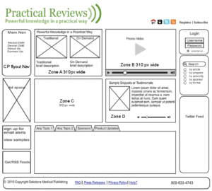
PracticalReviews.com

This site was designed to meet the needs of the marketing department and functional requirements of  Oakstone Publishing’s Practical Reviews CME products.

The marketing department desired more new media features, engagement, and ad placements than the previous platform. The new site was built on a proprietary .Net content management system.

Design and front-end development included audio, video, screencasted tutorials, aggregated RSS feeds, and CSS elements. Project began with wireframing and color palette choices and continued until site went live.

Praise from an Oakstone Publishing partner:
“The new site looks beautiful. The multimedia experience really adds to the branding of Practical Reviews an online, streaming, multimedia, 21st Century CME provider. Great job to the website team.” —Justin E. Anderson, Manager, Apollo Audiobooks, LLC.

Practical Reviews Homepage wireframe

Practical Reviews online tutorials